
Color has an impact beyond vibrancy alone—it can provoke thoughts, emotions, and reactions. There is a psychology to color that anyone who has taken an art or marketing course has likely encountered in some form.
Color is the foundation of any design and is often planned with intention and care. You can see this everywhere: in signage, advertisements, and even in movies, where color choices subtly guide how we feel about a scene, a character, or a message.
How Color Shapes Perception in Art
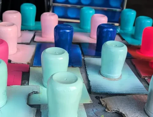
Using a few of my own pieces as examples, we have Molten Flow, full of vibrant oranges, reds, and yellows set against a black background, and Ocean Reverie, built from blues, white, and teal. Both pieces were created using the same technique, with only the color palette planned in advance.
For Molten Flow, I wanted energy, movement, and the feeling of heat. Ocean Reverie was almost the complete opposite—cool, flowing, and calming. While both pieces have the same level of movement, the colors dramatically change how each piece is perceived and the type of space people would most likely imagine them in.
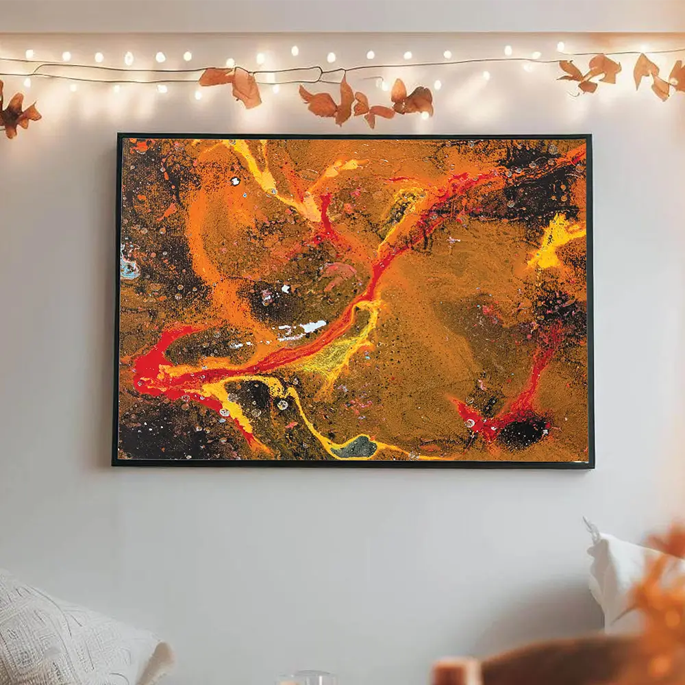
Molten Flow
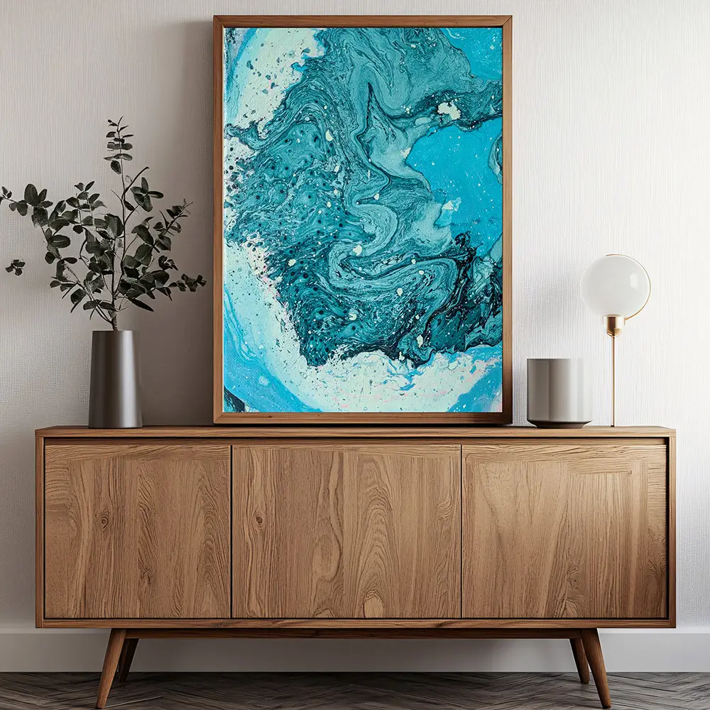
Ocean Reverie
Color in the Spaces We Live In
Have you ever thought about the colors used to paint walls in different spaces? In most calm or focus-oriented environments, reds and oranges are rarely used as dominant wall colors. These high-energy hues are often associated with heightened emotion or urgency, which can make a space feel more intense than restful.
That’s why they’re uncommon in offices or bedrooms, where focus or relaxation is the goal. This approach often extends to healthcare spaces as well, where both wall colors and artwork tend to favor soft tones and calming imagery.
Color as a Silent Marketing Tool
From a marketing perspective, color psychology plays a similar role. You’re far less likely to see blue used as the dominant color in high-intensity gym branding than reds or purples. Blue is a calming color, often associated with yoga, recovery, or lower-energy activities, while purple can symbolize strength, power, or focus.
Color choices allow viewers to draw conclusions about a business without a single word being used. For example, if you saw a logo featuring a yoga pose for a hot yoga studio, would you expect it to be blue and purple—or red and yellow? While blue and purple may suit traditional yoga, red and yellow make far more sense for hot yoga, where heat and intensity are central to the experience.
Color in Film and Storytelling
The same principles apply in movies. Color and lighting are used to subtly influence how we feel about a scene and to build emotional tension. You wouldn’t expect a wedding scene to be set under dark skies with muted colors—that visual language is far more appropriate for a funeral.
In horror movies, nighttime scenes, overcast skies, and desaturated tones are often used to subconsciously pull the viewer into a heightened state of tension.
To put it another way: if you were shown two forest paths, which one would you expect something bad to happen on—the bright, sunlit path with vibrant green foliage, or the shadowy, overcast path filled with darkness and contrast?

Image by Pexels from Pixabay

Image from Pixabay
Color Beyond Visual Art
Color influences us constantly, often without us realizing it. From the art we hang on our walls to the spaces we move through every day, color quietly shapes how we feel, what we notice, and how we interpret what we’re seeing.
Those same principles don’t stop with visual art. They also appear in storytelling and character creation—informing mood, personality, and even how we perceive heroes and villains. This is something I’ll be exploring more in future posts, as color continues to be one of the most powerful tools for shaping experience, both visually and beyond the page.
Color has an impact beyond vibrancy alone—it can provoke thoughts, emotions, and reactions. There is a psychology to color that anyone who has taken an art or marketing course has likely encountered in some form.
Color is the foundation of any design and is often planned with intention and care. You can see this everywhere: in signage, advertisements, and even in movies, where color choices subtly guide how we feel about a scene, a character, or a message.
How Color Shapes Perception in Art
Using a few of my own pieces as examples, we have Molten Flow, full of vibrant oranges, reds, and yellows set against a black background, and Ocean Reverie, built from blues, white, and teal. Both pieces were created using the same technique, with only the color palette planned in advance.
For Molten Flow, I wanted energy, movement, and the feeling of heat. Ocean Reverie was almost the complete opposite—cool, flowing, and calming. While both pieces have the same level of movement, the colors dramatically change how each piece is perceived and the type of space people would most likely imagine them in.
Molten Flow
Ocean Reverie
Color in the Spaces We Live In
Have you ever thought about the colors used to paint walls in different spaces? In most calm or focus-oriented environments, reds and oranges are rarely used as dominant wall colors. These high-energy hues are often associated with heightened emotion or urgency, which can make a space feel more intense than restful.
That’s why they’re uncommon in offices or bedrooms, where focus or relaxation is the goal. This approach often extends to healthcare spaces as well, where both wall colors and artwork tend to favor soft tones and calming imagery.
Color as a Silent Marketing Tool
From a marketing perspective, color psychology plays a similar role. You’re far less likely to see blue used as the dominant color in high-intensity gym branding than reds or purples. Blue is a calming color, often associated with yoga, recovery, or lower-energy activities, while purple can symbolize strength, power, or focus.
Color choices allow viewers to draw conclusions about a business without a single word being used. For example, if you saw a logo featuring a yoga pose for a hot yoga studio, would you expect it to be blue and purple—or red and yellow? While blue and purple may suit traditional yoga, red and yellow make far more sense for hot yoga, where heat and intensity are central to the experience.
Color in Film and Storytelling
The same principles apply in movies. Color and lighting are used to subtly influence how we feel about a scene and to build emotional tension. You wouldn’t expect a wedding scene to be set under dark skies with muted colors—that visual language is far more appropriate for a funeral.
In horror movies, nighttime scenes, overcast skies, and desaturated tones are often used to subconsciously pull the viewer into a heightened state of tension.
To put it another way: if you were shown two forest paths, which one would you expect something bad to happen on—the bright, sunlit path with vibrant green foliage, or the shadowy, overcast path filled with darkness and contrast?
Image by Pexels from Pixabay
Image from Pixabay
Color Beyond Visual Art
Color influences us constantly, often without us realizing it. From the art we hang on our walls to the spaces we move through every day, color quietly shapes how we feel, what we notice, and how we interpret what we’re seeing.
Those same principles don’t stop with visual art. They also appear in storytelling and character creation—informing mood, personality, and even how we perceive heroes and villains. This is something I’ll be exploring more in future posts, as color continues to be one of the most powerful tools for shaping experience, both visually and beyond the page.
Leave A Comment Cancel reply
Inside the Cauldron
No spam. Just art, ideas, and experimentation.
Sign up for the Prismatic Cauldron newsletter for blog updates, new artwork, behind-the-scenes process, and the occasional creative rant—delivered straight to your inbox.